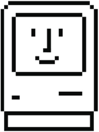
The Happy Mac icon was the first thing that appeared upon start-up of all Macintosh computers up until 2002, when it was replaced with the apple logo with the release of Jaguar versions of the Macintosh. The icon, designed as a friendly way to welcome users to the system, greeting them with a comforting smile. Introducing users to the computers with a friendly greeting was one of the ways Kare sought to achieve her goal of getting computers to appeal to users that we’re not tech-savvy, the warm smile working as a way to disarm users while they waited for their computers to boot. Thought simplistic, the design serves its purpose in an effective way while still not straying far from the pixelated aesthetics of the Macintosh, the fact that the icon was given human like features such as a nose allowing users to form an emotional connection with it.
In contrast, the Sad mac icon was shown only to indicate that there were serious hardware or software issues and was usually displayed over a dark screen with codes placed underneath the icon, with each code corresponding to a different error. The sight of the normally smiling icons eyes crossed out with X’s and the smile replaced with a frown again appeals to the users' emotions, except instead of hoping to elicit feelings of familiarity, it aims to elicit feelings of distress, especially since after 1987 the sight of the dead mac icon would be followed by the “Chimes of Death”. Kare’s ability to create visually appealing icons that can appeal to the users' emotions and elicit feelings of friendliness or fear from the user displays her skill as a designer.
.jpg)