Originally named “Elefont” for its heavy appearance, Chicago is a sans-serif typeface used for the initial Macintosh
computers all the way up till its replacement in 1997. Initially a bitmap font, the typeface is one of numerous ‘city’
fonts designed by Kare during her time at Apple, named after the city of Chicago after Kare was encouraged to name her
fonts after ‘world class cities’. Chicago was also the first font developed for use on the Macintosh. A disctinct feature
of the font is its ability to turn grey while remaining legible, it was able to achieve this effect by removing every other
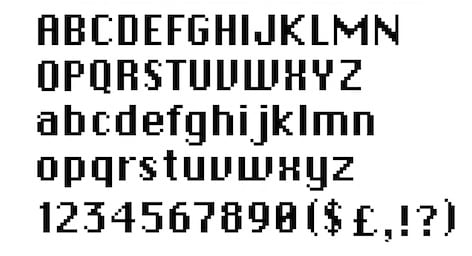
pixel. Since the font was initially conceptualized within the constraints of a low-quality display the font only consists of
vertical, horizontal and 45-degree elements, with the 45-degree elements meant to take over the duty of rounding the edges.
Due to the simplistic nature of the type face, creative methods were employed in order to help distinguish the characters from one another,
for example, since the zero and ‘o’ characters are designed so similarly, the zero has a slash through the middle to help distinguish it.
Another example would be between the uppercase ‘U’ and ‘V’ characters, the uppercase ‘U’ has two 45-degree angles placed on each side of its
bottom so that it is centered in a symmetrical way, while the uppercase ‘V’ only possesses one 45-degree angle on it’s right side, giving it
a more uneven look. But there are instances of two characters in the typeface having a striking resemblance to each other such as the lowercase
‘l’ and uppercase ‘I’ who are indistinguishable from each other.